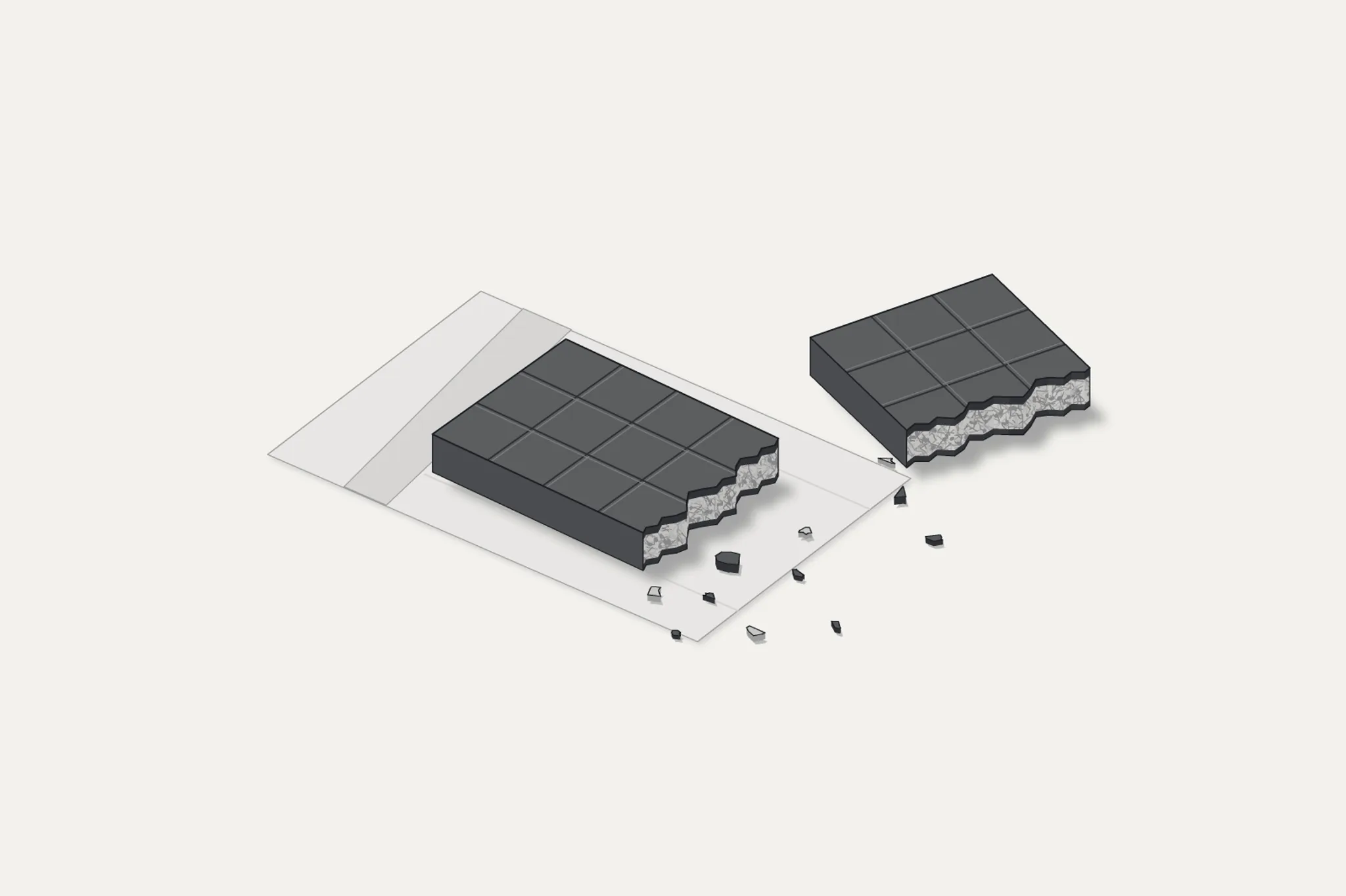
A social-media post places two pictures beside four prices. Nike shares are shown falling from $179.10 to $33.12. A chocolate bar is shown rising from $8.99 to $40. One comparison covers five years; the other supposedly covers a month. The conclusion arrives before anyone has checked the products, dates or markets: chocolate has outperformed Nike, and global famine is beginning.1
It is easy to dismiss the comparison. That would leave the more useful question unanswered.
What would an expensive chocolate bar actually tell us about the condition of the food system? How would we distinguish a fashionable product, a damaged harvest, an expensive supply chain and a household that can no longer afford enough to eat?
Those are different problems. They can also occur together. Following the bar beyond its price tag turns out to be a better exercise than arguing about the meme.
A calculation is not a comparison
The arithmetic deserves a fair hearing. Taking the screenshot’s numbers as assumptions, the calculations are straightforward:
| Calculation from the screenshot | Result |
|---|---|
| Nike: $179.10 → $33.12 | −81.51% |
| Chocolate: $8.99 → $40 | +344.94% |
| Difference between those percentage changes | 426.45 percentage points |
The advertised “426%” therefore has an identifiable origin. It is not random. But it is a difference in percentage points, calculated across incompatible periods and unlike objects. These are calculations from a claim, not independently established investment returns.1
An equity price and a retail price do not mean the same thing. A complete share-investment comparison would specify dates and account for dividends. A chocolate resale calculation would have to establish that the same product could be bought at the first price and sold at the second, in the claimed quantities, after selling costs and losses. A photograph supplies none of that evidence.
Even a verified retail price increase would not automatically produce an investment return. Buying a thousand bars does not summon a thousand customers willing to pay the most expensive price found online. It creates an inventory problem.
The screenshot also gives us no independently established date for its “today”, no product weight, no manufacturer and no matched retailer history. We cannot repair those omissions by selecting a plausible chocolate bar and treating it as the original. Nor should we replace the stock figures with a convenient peak and call that a five-year comparison.
A number can be correct inside a misleading sentence.
Several prices inside one bar
The pictured chocolate appears to contain the pistachio filling associated with Dubai-style chocolate. That identifies a possible product category, not a standard unit of trade. In May 2025, for example, PEOPLE reported a Trader Joe’s spokesperson confirming a $3.99 price for a forthcoming Dubai-style bar. That is a historical example of another product, not a before-and-after price for the bar in the screenshot.2
The distinction prevents a small but consequential mistake. Finding a cheap bar and an expensive bar establishes a price range. It does not establish inflation.
A proper retail comparison would hold the product and market sufficiently constant: ingredients, weight, retailer, currency, taxes and observation dates. When the weight changes, price per bar is not enough. When the recipe changes, even price per hundred grams needs qualification.
There is nevertheless a documented inflation story beneath the unsuitable comparison. A US Bureau of Labor Statistics analysis published in September 2026 found that candy and chewing-gum consumer prices rose 32.0% between December 2019 and November 2024. Its publication date does not make that a measurement of the latest twelve months. It is a US confectionery measure, not a global chocolate index.3
Cocoa also passes through contracts and processing before it reaches a shelf. The same BLS analysis describes manufacturers contracting for ingredients ahead of production and responding to cost pressure through prices and package sizes. An easing commodity quotation need not immediately reverse the price of a finished product.3
The bar contains other ingredients, packaging, work and distribution, as well as whatever margin its seller can obtain. Without a product-specific cost breakdown, we cannot honestly assign the $40 among those components. Calling the whole difference “cocoa inflation” would be as speculative as calling it all marketing.
The crop does not follow the chart
Cocoa’s underlying supply shock was real. In its March 2024 market report, the International Cocoa Organization described production difficulties in West Africa. Côte d’Ivoire and Ghana then accounted for roughly 54% of world output. For Ghana, the report discussed swollen-shoot disease, ageing trees, unfavourable weather and farmland lost to illegal mining.4
That concentration helps explain why a regional agricultural problem can become an international price event. Buyers cannot instantly replace a damaged crop with equivalent production somewhere else.
The biological delay is substantial. The ICCO report explains that newly planted cocoa trees can take three to four years to begin producing beans, with maximum yields coming later. A futures market can reprice in minutes. A replacement planting cannot.4
This is a useful place to resist the financial chart’s sense of time. An increased price may encourage investment, but it does not establish that farmers have financing, suitable land, healthy planting material or an income bridge while the trees mature. The price signal and the capacity to respond to it are separate questions.
The ICCO’s May 2026 bulletin put the 2023/24 cocoa deficit at 492,000 tonnes. Its August bulletin subsequently estimated a 37,000-tonne surplus for 2024/25, with gross production rising 8.5% to 4.733 million tonnes and grindings falling 3.3% to 4.649 million tonnes. Grindings measure processing activity, not people’s nutritional needs.56
That is evidence of an estimated seasonal recovery, combining more supply with less processing demand. It is not proof that every underlying vulnerability has disappeared.
There is also an explicit gap: the August bulletin says the Secretariat has temporarily withheld production and grindings data for 2025/26. The previous season’s surplus cannot be carried forward as a verified current balance. The public summary also warns that estimates can be revised.6
Writing the season beside the number changes what the number permits us to say.
A market can balance with fewer buyers
Lindt & Sprüngli’s results provide another view of the adjustment. For 2025, the company reported group-wide price increases of 19.0%, alongside a 6.6% decline in volume/mix. That second measure combines quantity and product mix; it should not be rewritten as a precise fall in tonnes of chocolate sold.7
On 29 September 2026, Lindt reduced its expected full-year organic sales growth from 4–6% to 0–2%, citing price-sensitive consumers and weaker orders after summer heat in important European markets. These are company disclosures about its business, not measurements of worldwide food deprivation.8
They illustrate a mechanism worth separating from the particular company. A market can move towards balance because production recovers, because customers buy less, or through both processes. A smaller shortfall does not, by itself, identify which adjustment occurred.
With chocolate, buying less may mean postponing a discretionary purchase or choosing something cheaper. We should not equate that with losing access to staple food. The comparison becomes useful only at the level of the mechanism: observed demand is what buyers are willing and able to purchase at the prevailing price. It is not a census of everything people need.
Imagine two markets with the same quantity offered and sold. In one, everybody can buy enough. In the other, some households purchase comfortably while others cannot buy their minimum requirement. A supply-and-sales total cannot distinguish those outcomes without additional information about distribution and access.
A supplied market can coexist with unmet needs.
That possibility is the reason to examine household conditions rather than treating a balanced commodity account as the end of the investigation.
The wider food market gives a mixed reading
The FAO Food Price Index provides a broader view than a chocolate bar. It tracks international prices across five food-commodity groups; it is not a supermarket basket, and cocoa is not included. In September 2026, the index averaged 136.0, up 5.8% year on year, but still 15.1% below its March 2022 peak.9
The components did not move together:
| FAO index | September 2026 change from a year earlier |
|---|---|
| Overall food index | +5.8% |
| Cereals | +17.2% |
| Vegetable oils | +18.3% |
| Sugar | +14.7% |
| Dairy | −19.1% |
Selected indices from FAO’s 2 October 2026 release. These are international commodity-price movements, not household grocery inflation.9
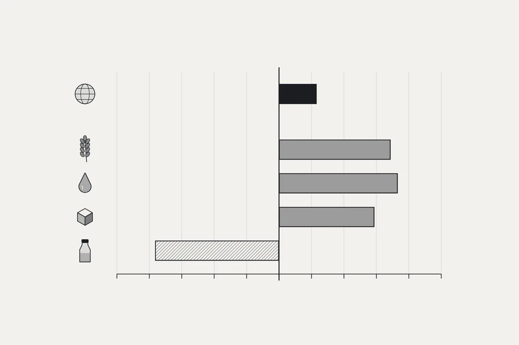
Those readings justify attention to food-price pressure. They do not support the idea that every part of the food system is experiencing the same shortage. A fashionable product cannot stand in for this basket.
The supply picture supplies an important counterweight. In its 2 October 2026 forecast, FAO put world cereal production at 2,979 million tonnes for 2026: 2.1% below the previous year’s record, but potentially the second-largest harvest recorded. Stocks at the close of seasons in 2027 were forecast at 950 million tonnes, with a stocks-to-use ratio of 31.7%.10
These are forecasts, not completed-harvest measurements. Even so, they do not describe a straightforward collapse in aggregate cereal availability.
In the same release, FAO lowered its cereal-trade outlook, citing constrained Black Sea shipping and insufficient alternative transport capacity. A crop can be present in the production total while becoming harder to move to the buyer who needs it.10
It would be equally careless to use the harvest forecast as an all-clear. The useful reading is narrower: substantial global production can coexist with rising prices and impaired delivery. That combination directs the next investigation towards location, transport and purchasing power.
Availability is only the first condition
FAO’s introductory framework distinguishes four dimensions of food security: availability, access, utilisation and stability. Food must exist; people must be able to obtain it; it must contribute to adequate nutrition, alongside conditions such as health and safe preparation; and those conditions must hold over time. Adequate supply at national or international level does not guarantee household food security.11
Consider an illustrative household with a fixed food budget. If the price of an unchanged basket increases by 20%, that budget buys roughly 16.7% less of the basket. Nothing has to disappear from the shop for the household’s position to deteriorate. This is arithmetic, not an estimate of how a particular population actually responds.
Actual households can change products, use savings, borrow, seek additional work or reduce other spending. Which adjustments are possible is an empirical question. The price series alone cannot answer it.
The same limitation applies to stocks. A warehouse total does not establish which goods can be released, transported, processed, purchased and prepared where they are needed. Stocks located elsewhere are not automatically available to every importer. Grain intended for feed or industrial use is not a count of meals ready for distribution.1011
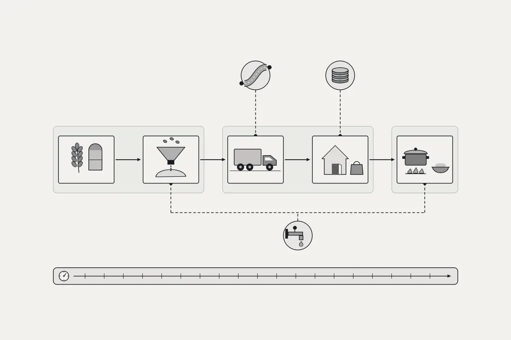
The test I would apply is operational: who needs the food, where is it now, what must happen before it can be eaten, and which step is currently failing? Depending on the answer, a larger harvest might help substantially, help only after a delay, or leave the immediate obstruction untouched.
Calling every obstruction “scarcity” hides information needed to understand the failure.
Hunger is not one counter
The human indicators also need their definitions attached.
The UN’s 2026 State of Food Security and Nutrition in the World assessment estimates that about 645 million people experienced hunger in 2025, or 7.8% of the world population. That share declined from 8.1% in 2024. The same assessment estimates that 2.69 billion people could not afford a healthy diet in 2025. Hunger and the inability to afford a healthy diet are different measures.12
The Global Report on Food Crises 2026 reports 266 million people facing high levels of acute food insecurity in 2025, across 47 countries and territories. This is a crisis-focused population measured using IPC/Cadre Harmonisé Phase 3 or above, or equivalent evidence. It is not a global census for 2026.13
These figures cannot be added together. Their populations overlap, their methods differ and their questions are not interchangeable. A report’s publication year is also not necessarily its observation year.
There is a particularly important warning in the GRFC release: 18 countries and territories lacked comparable 2025 data. The authors say the apparent reduction in its acute-hunger headcount largely reflects reduced data availability rather than a real improvement.13
An improving number can therefore have two very different explanations. Conditions may have improved, as the separate SOFI estimate indicates at global aggregate level. Or coverage may have deteriorated, as the GRFC warns for its crisis count. Reading the number without its denominator and coverage note can invert the interpretation.
This resembles a monitoring failure in any other complex system. Fewer reported incidents may mean fewer incidents. They may also mean that some of the instruments stopped reporting. Missing data should remain visible; it should not inherit the colour assigned to success.
Famine is not the next price band
The IPC uses Famine as an area-level classification involving extreme food deprivation, acute malnutrition and mortality. Household-level Catastrophe, also Phase 5, is not interchangeable with an area being classified in Famine. Serious emergencies and urgent assistance needs also exist below the famine threshold.14
A retail-price comparison does not measure those outcomes. Nor does being below an international price peak exclude them.
The GRFC’s joint release reports that famine was identified in Gaza Governorate and parts of Sudan in 2025. It attributes the escalation primarily to conflict and restricted humanitarian access, exacerbated by displacement. These are specific, documented crises, not an inference from a global commodity chart.13
A more recent example underlines the geographic problem. On 2 October 2026, Reuters reported WFP’s statement that 74% of households lacked enough food in the government-controlled areas of Yemen accessible to the agency. That scope must travel with the number: it does not describe all Yemen, and it is not itself a famine classification.15
The defensible conclusion is uncomfortable in both directions. The chocolate post does not establish the beginning of a generalised global famine. Yet rejecting its inference must not become a way to minimise actual famine or severe food insecurity.
We do not need to make a catastrophe global before the people experiencing it count.
The risks run through different clocks
The forward-looking risks are more informative when attached to a mechanism and a date.
In September 2026, the World Meteorological Organization warned that the established El Niño was expected to become very strong towards the end of the year and persist into early 2027. That is a climate outlook. It is not a probability estimate for famine, nor does it specify the result for every crop and region.16
To connect such an outlook to food access, we would need to follow the exposure: which growing area, which crop, which stage of development, how much irrigation or stored water, what alternative supply, and which households depend on that harvest or its earnings? Skipping those steps turns a forecast into atmosphere.
Fertiliser supplies offer another chain. Nitrogen fertiliser links agriculture to natural gas and energy infrastructure. A WTO analysis published in July 2026 described urea prices rising from around $400 a tonne to more than $850 in April, then retreating to $453 in June, during disruption to Gulf trade.17
That retreat is part of the evidence. Repeating the April peak as the current price would manufacture a more alarming story than the source supports. Equally, a later easing would not by itself establish that every farmer had obtained enough fertiliser when it was needed.
A useful assessment would ask when contracts were signed, when inputs arrived and whether application windows were missed. Prices have observation dates. Crops have biological deadlines. Household budgets have payment dates. Those clocks do not automatically align.
This is how apparently separate pressures might compound: an input disruption affects a planting decision, a harvest disappoints, replacement imports become expensive, and an already-stretched household has less room to adjust. That is a plausible pathway to investigate, not a claim that every step has occurred everywhere.
A dashboard worth building
I would not compress these observations into a single “global famine risk” score. Without a validated method, such a score would turn judgement calls about weighting and missing data into an apparently objective number.
A more useful instrument would preserve the distinctions:
| Layer | What I would measure | What the measure cannot establish alone |
|---|---|---|
| Retail prices | Matched products, weights, locations and household baskets | Global harvest conditions |
| Physical supply | Crop forecasts, revisions, usable stocks and export availability | Access for every household |
| Delivery and inputs | Fertiliser availability, route capacity, lead times and processing constraints | Adequate nutrition at destination |
| Purchasing power | Local staple prices against wages, incomes or transfers | Whether food can physically reach people |
| Human outcomes | Food consumption, nutrition and IPC/CH assessments | A complete global picture from partial coverage |
| Evidence quality | Observation dates, geographic coverage, missing data and revisions | Permission to treat an unknown as improvement |
This is a proposed monitoring design derived from the distinctions above, not an implemented platform or an official classification system.910111314
Every record would carry a unit, a place, an observation period, a publication date and a source. A forecast would remain labelled as a forecast after being copied into a chart. Revised estimates would retain their earlier versions rather than silently replacing the history.
The dashboard would also need to admit disagreement between its panels. Commodity prices easing while household consumption worsens is not necessarily a software error. It may be the condition we most need to understand.
Before interpreting a trend, I would check whether the same places and populations were still being observed. Before interpreting a stockpile, I would check whether the stock was usable and accessible. Before interpreting weaker demand as recovery, I would look for evidence of who had stopped buying and why.
Evidence that would reduce concern includes stronger harvest prospects alongside dependable deliveries and improving household purchasing power and consumption. Evidence that would increase concern includes compounding disruptions, deteriorating local access and worsening measured human outcomes. Neither set can be replaced by a photograph of an expensive confection.
Stocks buy time; delivery uses it
There is a concrete Swiss example of this distinction. The Federal Office for National Economic Supply describes compulsory food-stock targets generally covering two to four months, depending on the product. The range includes foodstuffs, commodities requiring processing and agricultural inputs. These are product-specific targets based on demand; actual holdings can differ.18
That is not a promise that every resident has an identical number of months of meals waiting somewhere. The existence of stored grain still leaves operational questions about milling, energy, transport and distribution. Counting tonnes answers one question; demonstrating how those tonnes become accessible food answers another.
This is adjacent to the question explored in When the Water Tower Runs Low: an available route and sufficient usable capacity are different things. A backup deserves examination at the point where it must carry the work, not merely where it appears on the diagram.19
For food, I would follow the chain all the way to a meal. That is the outcome against which the intermediate assurances have to be tested.
What the chocolate bar leaves behind
The original comparison cannot support its investment claim or its famine conclusion. Its percentages combine unmatched periods and unlike prices. Its photograph establishes neither a verified retail-price series nor conditions in a household facing hunger.
The wider investigation does reveal something worth keeping. Cocoa has experienced a substantial supply shock. Food-price pressure is uneven. Large aggregate harvests do not remove local delivery problems, and improving international indicators do not establish that every household can buy an adequate diet.491011
An expensive chocolate bar can start an inquiry. It cannot finish one.
The useful question is not how much more expensive the bar can become before we declare that the world is running out of food. It is whether the people who need food can still obtain enough of it, in the right place, in time.
Sources
Footnotes
-
Screenshot of a social-media post, author’s copy. Original publication date and matched market observations unverified; calculations are conditional on the displayed prices. ↩ ↩2
-
PEOPLE. Trader Joe’s Is Debuting Its Own Take on the Viral Dubai Chocolate. 23 May 2025. Historical retailer-spokesperson confirmation of a different $3.99 product; not a matched price history. Accessed 2026-10-03. ↩
-
US Bureau of Labor Statistics, Monthly Labor Review. Why is candy so expensive these days?. Published September 2026; cited 32.0% increase refers to December 2019–November 2024 in the United States. Accessed 2026-10-03. ↩ ↩2
-
International Cocoa Organization (ICCO). Cocoa Market Review: March 2024. March 2024, especially PDF pp. 2–4. Historical concentration, production pressures and the planting-to-production delay. Accessed 2026-10-03. ↩ ↩2 ↩3
-
ICCO. May 2026 Quarterly Bulletin of Cocoa Statistics — public summary. 29 May 2026. Used for the 2023/24 deficit and balance methodology; later 2024/25 estimates come from note 6. Accessed 2026-10-03. ↩
-
ICCO. August 2026 Quarterly Bulletin of Cocoa Statistics — public summary. August 2026 issue. Figures concern 2024/25; 2025/26 production and grindings explicitly withheld. The page’s dateline is inconsistent. Accessed 2026-10-03. ↩ ↩2
-
Lindt & Sprüngli. Lindt & Sprüngli achieves double-digit organic growth and higher profitability. 10 March 2026, reporting financial year 2025. Company-wide pricing +19.0%; volume/mix −6.6%, not a measured physical-tonnage decline. Accessed 2026-10-03. ↩
-
Lindt & Sprüngli. Lindt & Sprüngli adjusts sales growth guidance for 2026. 29 September 2026. Revised guidance, not realised full-year results; company attribution for European demand conditions. Accessed 2026-10-03. ↩
-
Food and Agriculture Organization of the United Nations (FAO). FAO Food Price Index — September 2026 release. Released 2 October 2026; observations for September 2026. International commodity indices, not grocery CPI; cocoa excluded. Accessed 2026-10-03. ↩ ↩2 ↩3 ↩4
-
FAO. FAO Cereal Supply and Demand Brief — October 2026. 2 October 2026 forecast vintage. Production, trade, utilisation and stocks have distinct reference periods; forecasts are not completed outcomes. Accessed 2026-10-03. ↩ ↩2 ↩3 ↩4 ↩5
-
FAO. An Introduction to the Basic Concepts of Food Security. 2008. Definitions of availability, access, utilisation and stability; not a current statistical release. Accessed 2026-10-03. ↩ ↩2 ↩3 ↩4
-
UN-Nutrition, summarising the joint FAO/IFAD/UNICEF/WFP/WHO assessment. SOFI 2026: UN Coordination for Nutrition Action. 21 July 2026, reporting 2025. Global hunger and healthy-diet affordability are separate, overlapping indicators. Accessed 2026-10-03. ↩
-
GRFC partners; joint release hosted by WFP. Acute food insecurity and malnutrition remain alarmingly high as crises deepen, UN, EU and partners warn in new report. 24 April 2026. 266 million refers to 2025 and 47 crisis contexts. Coverage losses qualify trend comparisons; famine geography and drivers attributed to the report. Accessed 2026-10-03. ↩ ↩2 ↩3 ↩4
-
Integrated Food Security Phase Classification (IPC). Famine facts. Accessed 3 October 2026. Area-level Famine is not interchangeable with household-level Catastrophe. Accessed 2026-10-03. ↩ ↩2
-
Reuters; reporting a WFP statement. Three in four families go hungry in parts of Yemen from new fighting. 2 October 2026. WFP statement restricted to government-controlled areas accessible to the agency, not all Yemen. Accessed 2026-10-03. ↩
-
World Meteorological Organization (WMO). El Niño set to become very strong, raising risks of extreme weather in 2027. September 2026 climate outlook for late 2026/early 2027. Not a famine forecast. Accessed 2026-10-03. ↩
-
World Trade Organization (WTO). WTO Data Blog analysis of fertiliser trade and prices, 10 July 2026. 10 July 2026. Price sequence ends in June; do not present the April peak or June reading as the October price. Accessed 2026-10-03. ↩
-
Swiss Federal Office for National Economic Supply (FONES). Range of compulsory stocks. Accessed 3 October 2026. Product-specific target cover, not a guarantee about current holdings or every household’s meals. Accessed 2026-10-03. ↩
-
Thierry Gilgen ICT Library. When the Water Tower Runs Low. Existing Exploration volume, 17 August 2026. Related reading on physical capacity and usable alternatives. Accessed 2026-10-03. ↩